
Wing Chun Kuen
A new website and visual identity that reflects the values, philosophy, and character of Wing Chun Kuen, a martial arts dojo located in Zurich.
OVERVIEW
Project: Wing Chun Kuen
Project Type: Website
My Role: User Flow / User Interface Design / Branding (Color Palette)
Time: April 2025
INTRODUCTION
Wing Chun Kuen is a martial arts dojo located in Zurich. I was tasked with designing their new website and defining a visual identity that reflects their values, philosophy, and character. The goal was to create a digital presence that feels authentic, grounded, and accessible, like the art of Wing Chun itself.
THE CHALLENGE
The previous online presence of Wing Chun Kuen didn’t reflect the character of the dojo. My task was to develop a minimal yet impactful color palette for their brand identity, suitable typography, and to design a website that clearly communicates what Wing Chun is, as well as when the training takes place. It was also essential to present Wing Chun not just as a sport, but as a mindful practice rooted in tradition.
THE GOAL
The main objectives were to attract new students by conveying trust and professionalism and to position Wing Chun Kuen as a serious, expert-led dojo in Zurich. The website needed to be informative yet welcoming, encouraging contact and participation, especially for beginners or curious newcomers.

THE SOLUTION
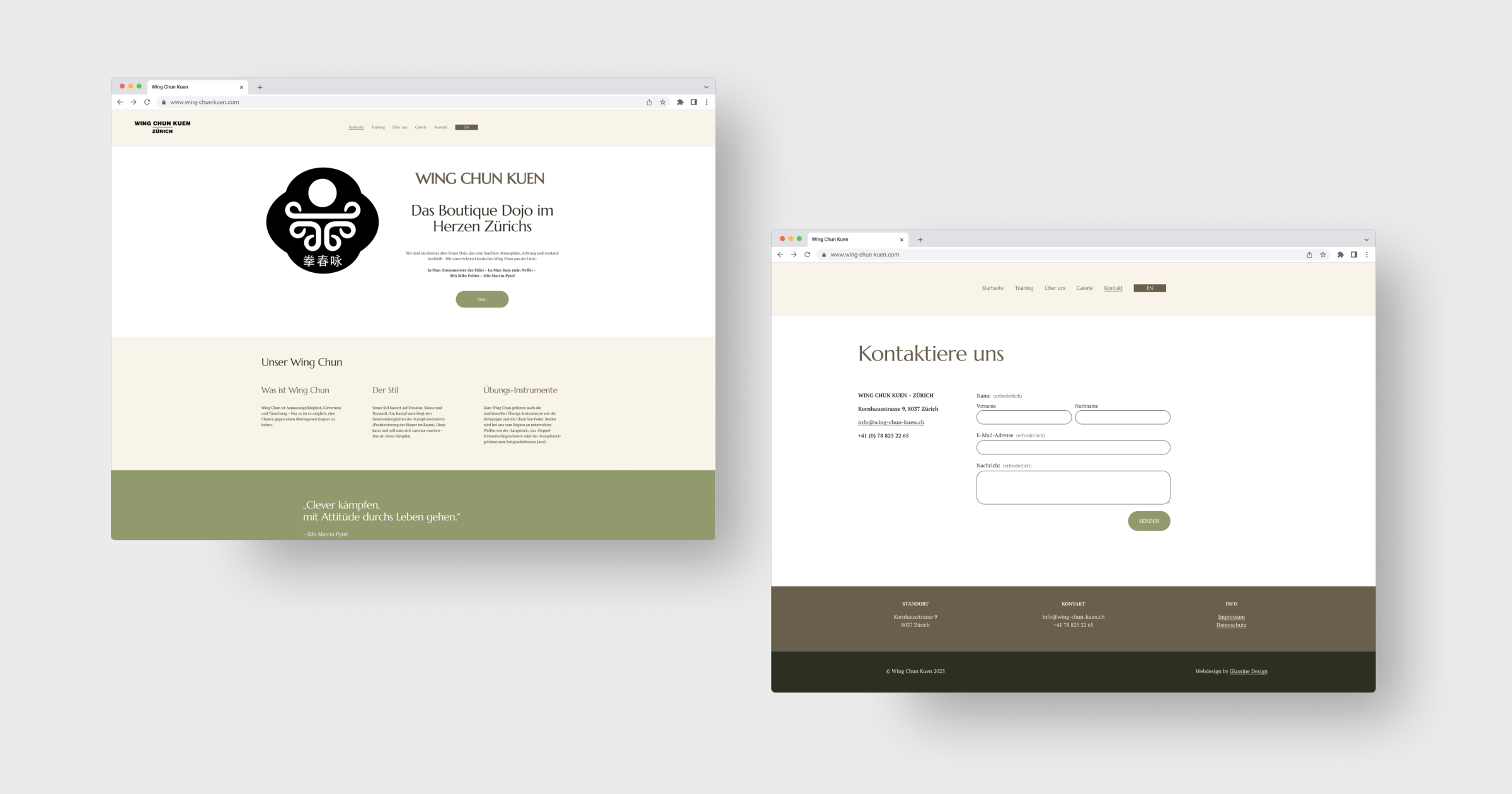
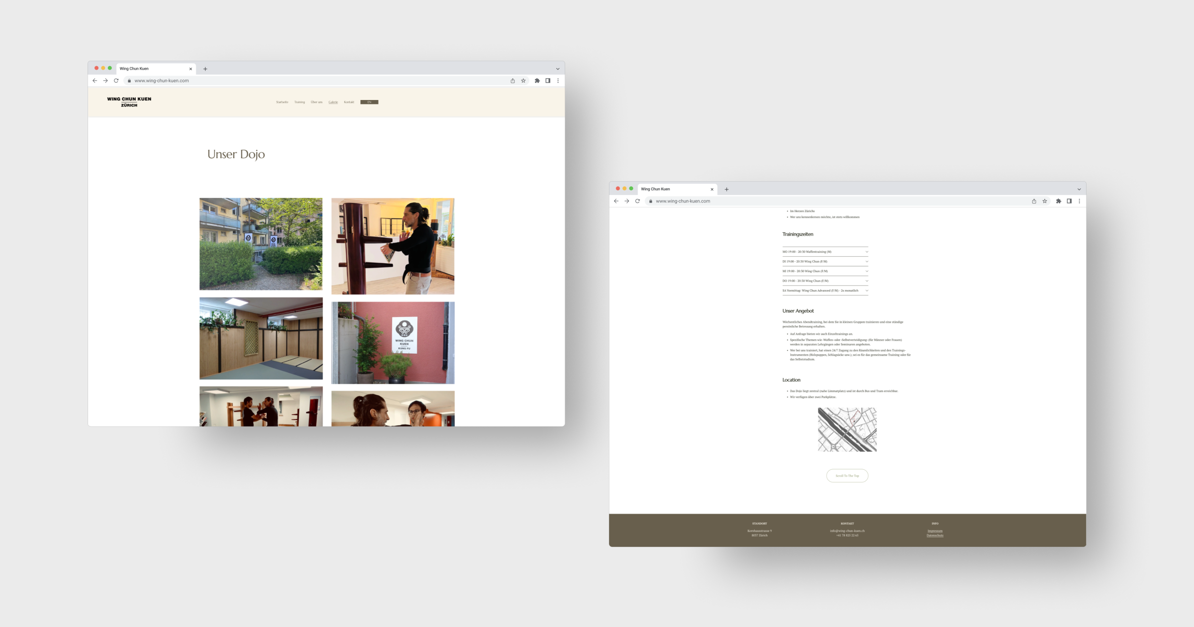
I created a clean, modern website that uses a calm, earthy color palette consisting of dark brown and bamboo green, evoking natural strength, tradition, and balance. The homepage features key information like training times, location, and contact information, reducing friction for first-time visitors. A prominent photo gallery provides insight into the dojo’s atmosphere and community, while the minimal navigation ensures ease of use across all devices. The contact form is deliberately simple, helping to turn interest into action.
THE PROCESS
I began by exploring Wing Chun's philosophy to ensure the visual language would reflect its calm, precise, and grounded nature. I developed a color palette and typography system inspired by traditional Asian aesthetics. After several iterations and user feedback, I refined the design with a focus on hierarchy, clarity, and accessibility. Mobile responsiveness was prioritized, considering the needs of potential users searching for dojos while on the go. The final result is a focused, clear website that not only informs but also invites the visitor.
RESULT
The new web design resulted in a 70% increase in inquiries for the client.